Description
Project: Ike Todo List
Platform: Android (Lollipop 5.0 and up)
Download: http://goo.gl/W01xqO
Contact: ![]() @
@![]() ">
">![]() @
@![]()
Creators: Jenny Spurlock (Code, Visual Design), Long Ma (Motion/UX Design, Code)
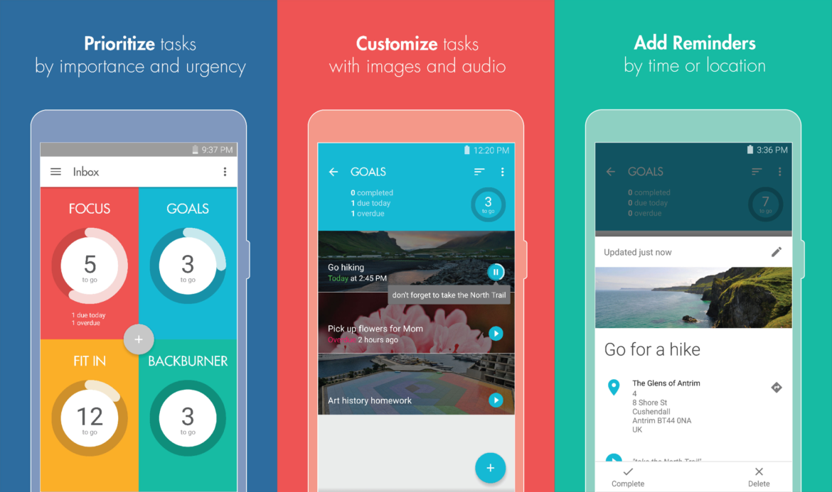
For the past 6 months, we’ve been working out of the Dallas Makerspace on an Android app called Ike Todo List, which we launched a few weeks ago. President Eisenhower once said that “what is important is seldom urgent, and what is urgent is seldom important”, and created a priority matrix to organize his tasks by importance and urgency. We created this app in the spirit of his priority matrix, designed it for the daily challenges we face in more modern times, and added our own playful touches through motion and color.
Features
- Organize tasks into a priority matrix depending on their importance/urgency
- Manage tasks using intuitive gestures
- Create time reminders so you never forget when to do something
- Create location reminders with geofencing to alert you when you reach a specific location
- Add audio recordings using Google’s speech to text
- Add images to jazz up your tasks, or to add more information about a task
- Celebrate your accomplishments with delightful animations
- Visualize your progress as you complete tasks
- Organize your tasks into different lists
- Customize each task lists with color themes
- Go pro to unlock all the themes and the ability to add unlimited location reminders, images, and audio recordings
Design Process
1. Prototyping/Idea Generation
We used whiteboards, sketchbooks, and post-it notes to figure out the app flow, design individual ui components, and iron out the basic user experience of the app. In this phase, we generated a lot of different ideas and hit some dead-ends, but this process helped us refine the user experience and ensured that we explored more than one design solution to get there. We researched other todo list app competitors and figured out a monetization strategy and a feature set that worked for us. We decided on our app’s core values: a simple, playful todo list that lets you prioritize daily tasks.
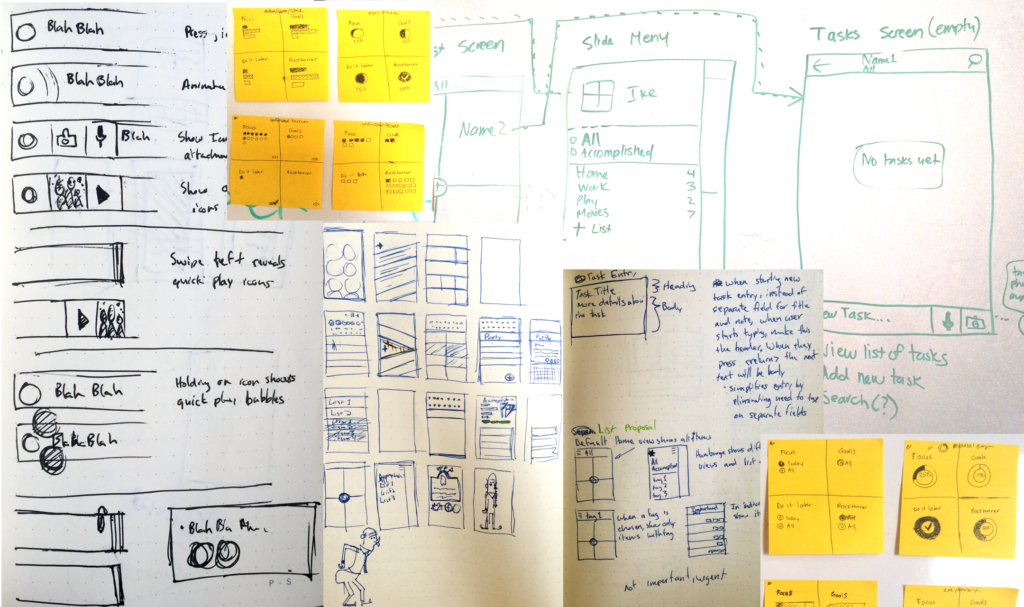
Prototyping with whiteboard sketches, sketchbooks, and post-its
2. Mockups/Wireframes
Once we had an idea of the basic app flow, we started generating wireframes in Adobe Photoshop to nail down the visual look and adhere to Google’s Material Design standards. Our intention was to create near pixel-perfect designs so that we could begin implementing and coding the app.
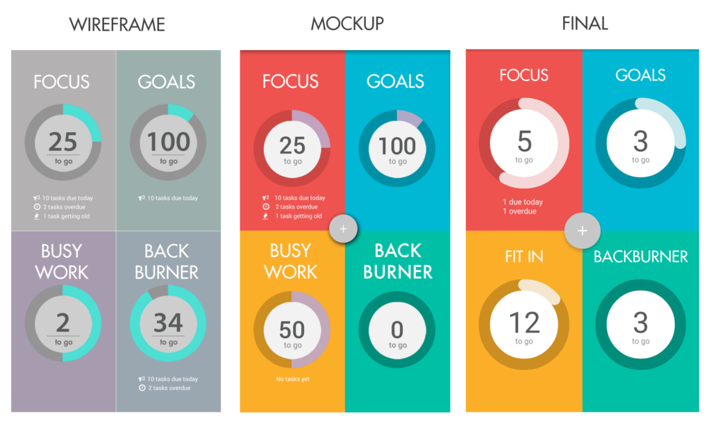
Wireframes, Mockups, and Final Designs
![]()
Logos and branding explorations
3. Motion Design
One of the core values for the app was that it be “playful”, a feat primarily accomplished through in-app transition animations and gesture animations. We wanted the user to feel rewarded for completing or deleting a task, so we performed a series of motion studies to animate tasks to support that feeling.
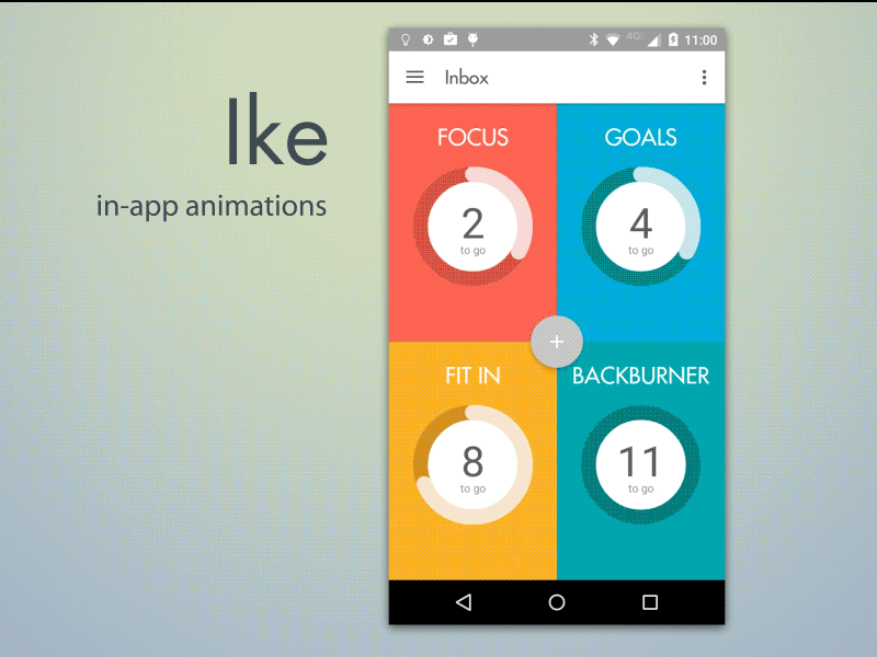
In-App Animations. View more motion studies here.
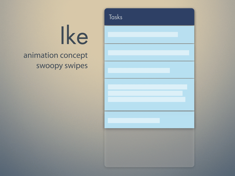
Gesture animation concepts
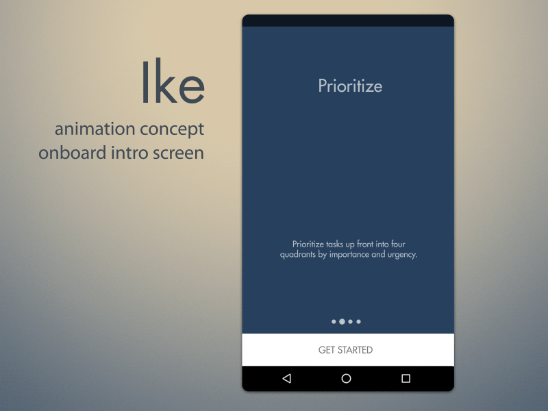
4. Onboarding
The final phase of our app was to onboard first-time users. One of our primary goals was to highlight the biggest features of our app through an animated introduction. We created the following animations in After Effects and rendered them out to GIFs. These are the first thing a user sees when downloading the app.
Wrap Up
We hope we’ve provided you with a good glimpse into our process, and we’d love it if you could support us by downloading the app (and telling your friends about it) :). Thanks everyone!
– Jenny & Long